Big Brother Zine - Making a zine for the first time
We were given a zine project to do at the beginning of our course. We were tasked to create a zine based on an object that has been with us for a long time.
Creating a zine was something new to me and I have never made one before. Going into the project was a little bit nerve-wracking at first because I did not know what to expect and I had no clue what to do with my zine. The idea of being able to do whatever we want with our zine as long as we hit the brief was exciting but intimidating because I had to come up with content and make everything from scratch. I was a little clueless but after selecting my object, the ideas flowed naturally.
Brief
Create a zine based on an object that has been with you for a long time.
A5-size, and we need to make use of 2 workshops.
Choice of object

Figure 1. My Pooh Bear that has been with me since I was 8.
Firstly, I had to choose an object for the basis of my zine and the object that I thought of was a Pooh Bear that I had since I was eight. I call him Big Brother Pooh (see Figure 1) because he felt like a big brother since I was young. He has been through thick and thin with me when I was struggling with school work and when I get scolded by my parents. He was always a constant in my life throughout primary school, secondary school, polytechnic and even when I moved to London. When I was young, my sister and I would pretend that he was real and would give him voices.
Ideation


Sketchbook ideation
Since my Pooh Bear has been with me almost my whole life, I wanted the basis of my zine to be seen from a perspective of writing a letter. Writing a letter to my Pooh Bear whom I call Big Brother in this zine.
"But fairy tales survived, irrepressibly, and I have become even more drawn to them as I grown older, because they began to represent childhood, that vividness of experiences in the midst of inexperience." (Warner, 1994). This quote was what thoroughly inspired the concept of my zine. As I grow older, I have become more attached to my Pooh Bear and the memories attached to it. Now that I'm in a totally different country, pursuing my passion for the arts, I miss those times where I would just foolishly have fun and pretend that I'm talking to a real-life brother with my Pooh Bear. This eventually sparked the idea of me writing a letter to him as the main concept of my zine and how much I appreciate him.
By writing letters to him, I felt like it was a way for me to bring my Pooh Bear to life. Instead of seeing him as just an object, I thought to make my zine as if it was excerpts of letters would be interesting to see how I would speak to a big brother.
I initially wanted to include quotes of what a big brother would say but I did not include it in because it felt ingenuine in my opinion and I did not have any real experience of having a big brother. So, I decided to come up with short write-ups inspired by real-life stories of my childhood. An example would be, "WE USED TO PLAY MUSICAL CHAIRS IN THE LIVING ROOM." This quote talks about how I used to play musical chairs when I was young with my big brother (who is my Pooh Bear). I actually used to play a lot of musical chairs with my friends when I was younger and so I decided to use that part of my childhood and created these imaginary scenarios of what kind of games I would play if I ever had a big brother growing up. In a way, it is also me giving appreciation to my Pooh Bear who has been there with me ever since I was young.
Research

Figure 2A. Monochromatic colours from pop-punk zines. (Triggs, 2010).

Figure 2B. Inspiration for my zine layout and photo collage. (Triggs, 2010).
I did some research on the aesthetic of pop-punk zines as I was intrigued by the colours, use of text and layouts in general (see Figure 2A & 2B). I did not want my zine to have too many colours as it would seem very messy. These pop-punk zines had a very lo-fi effect and I wanted to mimic that.

Figure 3. (Behind the Zines: Self Publishing Culture, 2011, p. 206-207)
I happened to stumble upon this book too while I was searching for the book, Fanzines (see Figure 2A & 2B). This particular page in the book (see Figure 3) caught my eye. The zine is fairly illustrative and does not have much text which I think ties into my zine because I want to include illustrations along with my short quotes so that my zine would look more visually interesting.
Mock Up


Rough mock-up of my zine
I was inspired by some of the pop-punk zines and the way they layout their images and texts. I personally was not very keen with the aesthetic of those zines but more so of the layout, therefore when I created the mock-up for the first version of my zine, I tried to overlay my illustrations and texts. I still wanted to keep the clean look but with a little bit play of typography on it.
I included a page of lyrics from a song called Fireflies by Owl City. I was obsessed with that song when it first came out and would always sing it out loud in my room in the presence of my Pooh Bear.
I decided to add small inner pages to my zine with images of me and my Pooh Bear so that at least people are reminded that the object that I chose for my zine is my Pooh Bear.
Feedback for 1st iteration

Feedback from my classmates


Illustrations that I drew on newspaper


Figure 4. Crumpled paper of the words that I wrote.

Creating a zine was something new to me and I have never made one before. Going into the project was a little bit nerve-wracking at first because I did not know what to expect and I had no clue what to do with my zine. The idea of being able to do whatever we want with our zine as long as we hit the brief was exciting but intimidating because I had to come up with content and make everything from scratch. I was a little clueless but after selecting my object, the ideas flowed naturally.
Brief
Create a zine based on an object that has been with you for a long time.
A5-size, and we need to make use of 2 workshops.
Choice of object

Figure 1. My Pooh Bear that has been with me since I was 8.
Firstly, I had to choose an object for the basis of my zine and the object that I thought of was a Pooh Bear that I had since I was eight. I call him Big Brother Pooh (see Figure 1) because he felt like a big brother since I was young. He has been through thick and thin with me when I was struggling with school work and when I get scolded by my parents. He was always a constant in my life throughout primary school, secondary school, polytechnic and even when I moved to London. When I was young, my sister and I would pretend that he was real and would give him voices.
Ideation


Sketchbook ideation
Since my Pooh Bear has been with me almost my whole life, I wanted the basis of my zine to be seen from a perspective of writing a letter. Writing a letter to my Pooh Bear whom I call Big Brother in this zine.
"But fairy tales survived, irrepressibly, and I have become even more drawn to them as I grown older, because they began to represent childhood, that vividness of experiences in the midst of inexperience." (Warner, 1994). This quote was what thoroughly inspired the concept of my zine. As I grow older, I have become more attached to my Pooh Bear and the memories attached to it. Now that I'm in a totally different country, pursuing my passion for the arts, I miss those times where I would just foolishly have fun and pretend that I'm talking to a real-life brother with my Pooh Bear. This eventually sparked the idea of me writing a letter to him as the main concept of my zine and how much I appreciate him.
By writing letters to him, I felt like it was a way for me to bring my Pooh Bear to life. Instead of seeing him as just an object, I thought to make my zine as if it was excerpts of letters would be interesting to see how I would speak to a big brother.
I initially wanted to include quotes of what a big brother would say but I did not include it in because it felt ingenuine in my opinion and I did not have any real experience of having a big brother. So, I decided to come up with short write-ups inspired by real-life stories of my childhood. An example would be, "WE USED TO PLAY MUSICAL CHAIRS IN THE LIVING ROOM." This quote talks about how I used to play musical chairs when I was young with my big brother (who is my Pooh Bear). I actually used to play a lot of musical chairs with my friends when I was younger and so I decided to use that part of my childhood and created these imaginary scenarios of what kind of games I would play if I ever had a big brother growing up. In a way, it is also me giving appreciation to my Pooh Bear who has been there with me ever since I was young.
Research

Figure 2A. Monochromatic colours from pop-punk zines. (Triggs, 2010).

Figure 2B. Inspiration for my zine layout and photo collage. (Triggs, 2010).
I did some research on the aesthetic of pop-punk zines as I was intrigued by the colours, use of text and layouts in general (see Figure 2A & 2B). I did not want my zine to have too many colours as it would seem very messy. These pop-punk zines had a very lo-fi effect and I wanted to mimic that.

Figure 3. (Behind the Zines: Self Publishing Culture, 2011, p. 206-207)
I happened to stumble upon this book too while I was searching for the book, Fanzines (see Figure 2A & 2B). This particular page in the book (see Figure 3) caught my eye. The zine is fairly illustrative and does not have much text which I think ties into my zine because I want to include illustrations along with my short quotes so that my zine would look more visually interesting.
Mock Up


Rough mock-up of my zine
I was inspired by some of the pop-punk zines and the way they layout their images and texts. I personally was not very keen with the aesthetic of those zines but more so of the layout, therefore when I created the mock-up for the first version of my zine, I tried to overlay my illustrations and texts. I still wanted to keep the clean look but with a little bit play of typography on it.
I included a page of lyrics from a song called Fireflies by Owl City. I was obsessed with that song when it first came out and would always sing it out loud in my room in the presence of my Pooh Bear.
I decided to add small inner pages to my zine with images of me and my Pooh Bear so that at least people are reminded that the object that I chose for my zine is my Pooh Bear.
Feedback for 1st iteration

Feedback from my classmates
The following week when we showed our zine mock-ups to the class, we had a feedback critique session and we were given post-it notes so that we can write feedback for each other's zine.
I was delighted to see that my zine was reciprocated well by my classmates. However, there were comments which said that I needed to add more pages to my zine which is understandable because it was still the early stages.
Creating the illustrations + photo collages
These are the illustrations that I created for my zine. Each illustration represents the short write-up.


Illustrations that I drew on newspaper
As for my photo collage, I wrote the words "fear" and "failure" on pieces of paper (see Figure 4), crumpled it up, dripped a little bit of water and after that scanned it and put it into Photoshop. I manipulated to make it seem blurry as if they are my insecurities however with the presence of my Big Brother Pooh he kind of keys out those words which explains why I placed his head in my photo collage.


Figure 4. Crumpled paper of the words that I wrote.

Figure 4. Photo collage that I made by scanning in the crumpled paper into Photoshop and adding in effects
I also asked my mum to find pictures of me when I was young with Big Bro Pooh. She scanned them and sent it to me via email.


Figure 5. Photo collage that I did in InDesign.
I wanted to give like a copy and paste effect to the photo so I used the same image and cropped it in different ways and overlayed it multiple times (see Figure 5). This photo collage of me was included in the smaller inner page of my zine.
Making use of the workshops
For my zine, I wanted to make use of risograph and letterpress printing. Since I was doing risograph, I was restricted with my colour palette, therefore, I chose the colours blue and pink because they are complementary colours and I personally liked those colours.
Before I even started doing the workshops, I went down to the print and finishing studio and talked to Tony about my project. He advised me on how to layout my design file based on the workshops that I was planning to use which was letterpress, risograph, and digital reprographics. Most of the pages will be printed on risograph, the page with the song lyrics will be printed using digital reprographics. It was a complicated process.
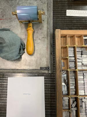


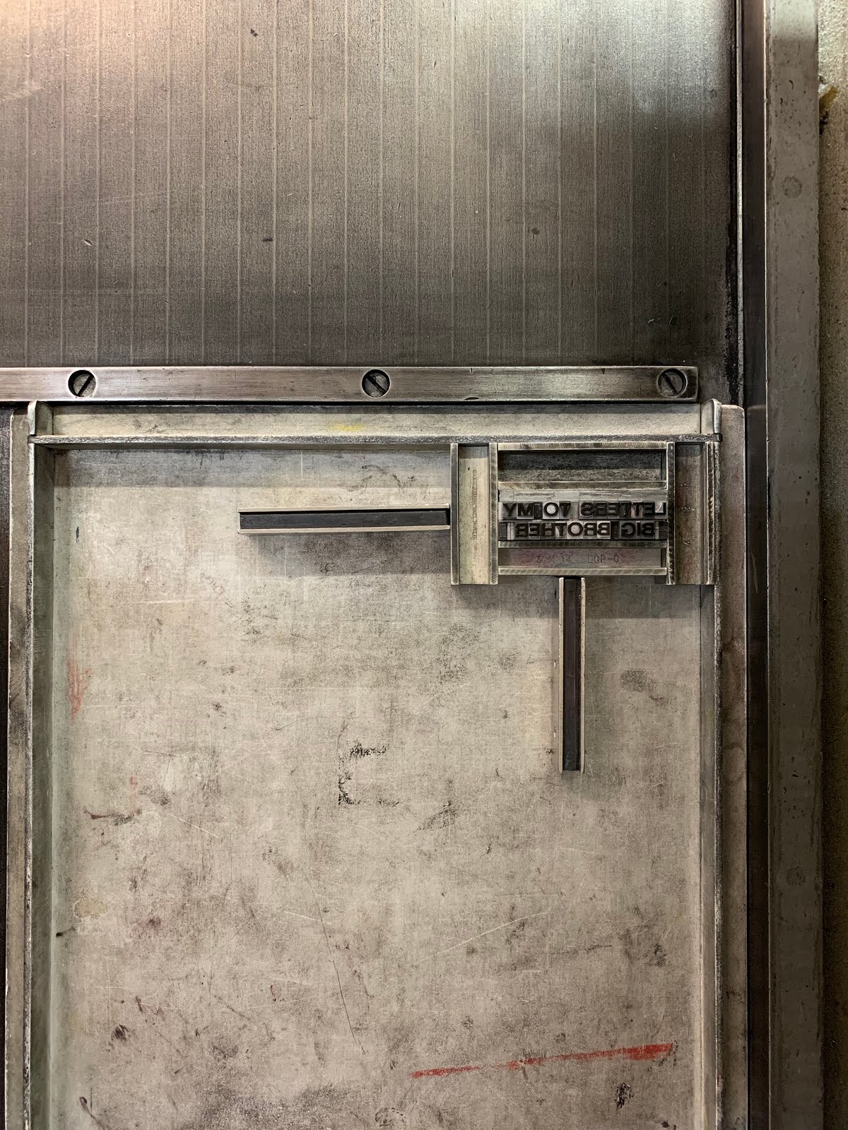
Setting up my texts at the Letterpress Workshop
However, after speaking to Klara I realised that time is not on my side and therefore, I decided to just letterpress the title and the small inner page of my zine. For the font, I chose Folio Medium Extended because I personally I liked the way it looked and also I think Sans Serif will look better on my zine compared to Serif fonts.
I only managed to do test prints but never got the chance to actually letterpress my actual zine because I had to rush for classes after doing the test prints and by the I got back to do the actual prints, the room was full. Furthermore, I was advised by Tony to do risograph before I letterpress as I needed my paper to dry. Due to the risograph also already being booked on days that I wanted to use it, I wasn't able to do both risograph and letterpress as it also clashed with my classes.
There were a lot of steps that I needed to take before I could actually proceed to the next finishing.


After printing risograph
Tony was kind enough to cut some paper that was lying around in the risograph paper. He cut up about 38 pieces of paper so that I had multiple tries to register my work.
Risograph was really hard as I had to save multiple PDFs for each page and the layout could be different. It was confusing, and because I had to print on both sides of the paper, registering my work was not easy as risograph is not very known for its accuracy. It takes a few tries. However, after a few prints, I got the hang of it. Not until I realised two of the pages were in the wrong sequence. The song lyric page was supposed to be at the end of the zine, however, after printing and sorting it out I then realised that page was in the wrong position. There was a lot of trial and error.
I think in the near future when I'm creating my zine I will not use risograph because it is quite complicated especially when it comes to having to layout my design file.
1st iteration


Figure 6. Printed the pages and colour was wrong, therefore, I had to use markers to overwrite my mistakes.


The first iteration of my zine
Since I was not able to use letterpress, I used a marker and tried my best to write out the texts so that it would fit the aesthetic of my zine. As for the page with the song lyrics, I made some minor mistakes of the word 'FIREFLIES" one of the letters is in a different colour and I only realised that after I printed our everything (see Figure 6), so I did the same thing and used a marker to write over it. It kind of gave off a very messy look which was nice.
Feedback - 1st iteration
After getting feedback from my teacher and peers, they said the zine felt a little bit empty because of one of the pages with all texts and I totally understand where they are coming from because it was a last-minute change that I had to do since I messed up the sequence of the pages. They liked the overall concept of my zine and how I looked but there could be more improvements with filling out my zine.
∙∙∙∙∙
A re-do of my zine
Looking at the outcome of my first zine, I felt kind of disconnected to it. As much as I was fully appreciative of the fact that I got the chance to use risograph, I personally thought it did not fit the idea/concept of writing letters to my Big Bro. I wanted the zine to feel like you are opening an actual envelope, I think that would help propel my concept of the zine further.

Written ideas of reworking my zine
The first iteration of my zine was me writing letters to my Big Bro Pooh, however, after analysing the content of my zine, I decided to switch the recipient of the letter. I felt having Big Bro Pooh writing a letter to me from his perspective would be easier to convey my passion to become a designer, better.
Ideation + Inspiration
I wanted my zine to be a huge letter from Big Bro Pooh to me, therefore, I was particularly inspired by People of Print. They are a team of art directors, project managers, graphic designers, illustrators and printmakers based in London and across the globe. (People of Print, 2019)

Screenshot of the Posterzine website (Posterzine, 2019)
They self-publish their own magazine called Posterzine. It is basically like any other normal zine just that when you open up, it becomes a poster and I was particularly intrigued idea as it fit my concept of wanting my zine to open up like I was reading a letter.

Figure 7. Sketches of how I want my zine and envelope to look like
I realised that if I wanted my zine to fold back into A5 size (because that is the requirement), my poster zine would have to be A2 size. I sketched out how my layout would look like (see Figure 7), for example, where I would look like my text and images to be etc.
Mock-up


Envelope mock-up
For the envelope, I wanted to create it from scratch. I wanted to sew the sides of the envelope using a brown thread to give it more of a handmade feel, and since my object is a teddy bear, I think using a thread would give hints that my object is a soft toy.

As for the zine itself, I pasted two A3 papers that I had leftover from the previous zine that I did so that it would give me a rough idea of how I wanted to crease and fold my zine.
The design of the zine was fairly straight forward as I already knew I wanted my zine to look vintage with some modern elements.

Figure 8. Final design for the front of my zine
I used some of the illustrations that I did for the previous version of my zine and placed it in this design (see Figure 8) as I felt like there was still a cohesive theme. I wanted to include a visual of my teddy bear, therefore, I used the illustration of my Big Bro Pooh and added an effect so that it would not be too obvious. Just a hint of that illustration because that was not the main focus.
I purposely had some of the text go beyond the bleed as I wanted to give it an imperfect look to my zine. I also wrote the quote "you're going to do amazing things" to make it seem like it was my teddy bear writing it. The huge texts, "HEY JOANNE", were done in Photoshop. I traced over old newspaper titles and used them as fonts. I was going for an orange/brown colour palette because I wanted to evoke warmth through the letter.
As for the back of my zine, I reused the same photo collage that I did (see Figure 4) but added the quote, "YOU DON'T HAVE TO BE THE BEST. JUST BE THE BEST THAT YOU CAN BE." My sister said this to me while I was talking to her on FaceTime and she gave me these words of encouragement which really inspired me and I felt like it fit the theme of warmth and encouragement for my zine.

Back of my zine
Printing out my zine

I went down to the print and finishing room and spoke to Tony about my zine. Yet again, Tony was kind enough to sift through his drawer of leftover papers and found a piece of Fabriano paper which had a very nice rough texture. I wanted my zine to feel rough and textured like you are holding an old letter written back in the day. Therefore, this paper material was the perfect one. I was ecstatic and proceeded onto print it out using the Espon InkJet printers.
As for my envelope, I designed it in such a way that the "FROM" and "TO" and were in the colours of a post office. You would usually associate post office to the colours blue and red, which is why I chose those colours.
FINAL


Final packaging of the zine + postcards, photos were taken in the Copy Stand Studio
Unwrapping the zine
Final Thoughts
Overthinking was an understatement, there were multiple times where I thought this was not good enough, but I think the best thing to do was to literally, just do it. I decided to do my zine digitally on InDesign yet I still wanted it to be handmade which explains the stitching of my envelope and tying lose postcards of my home together. The idea of using film photos that I took back when I was in Singapore and creating them into postcards made this zine project so much more personal for me.
Overall, what I can learn from this experience was embracing the failure and process. I always had the preconception that everything had to be planned out to be perfect, but not everything is perfect. No plan is perfect. That was what I realised after this project. The night before I made sure all my PDFs were ready for print, however, the next day when I went to use the risograph for my first iteration of the zine, there were circumstances that caused me to change my whole concept of the zine. I realised risograph was not the right printing medium for me and because of that my plan of using risograph and letterpress was ruined. Well, that was not the end of the world, I went back home and took a step back to look at my ideas and how I can translate it to a better version. Eventually, that was how I derived to creating an actual envelope package to support the concept of my zine.
Translating concept to the material was the key focus in this project.
Bibliography
Behind the Zines: Self Publishing Culture. (2011) Berlin: Gestalten
People of Print (2019) About us. Available at: https://www.peopleofprint.com/about/ (Accessed: 1st November 2019).
Posterzine (2019) [Screenshot]. Available at: https://posterzine.com/collections/posterzine/products/posterzine-issue-49-le-gun (Accessed: 1st November 2019).
Triggs, T. (2010) Fanzines. London: Thames & Hudson Limited
Warner, M. (1994) From The Beast To The Blonde. London: Chatto & Windus Limited
For my zine, I wanted to make use of risograph and letterpress printing. Since I was doing risograph, I was restricted with my colour palette, therefore, I chose the colours blue and pink because they are complementary colours and I personally liked those colours.
Before I even started doing the workshops, I went down to the print and finishing studio and talked to Tony about my project. He advised me on how to layout my design file based on the workshops that I was planning to use which was letterpress, risograph, and digital reprographics. Most of the pages will be printed on risograph, the page with the song lyrics will be printed using digital reprographics. It was a complicated process.


Setting up my texts at the Letterpress Workshop
However, after speaking to Klara I realised that time is not on my side and therefore, I decided to just letterpress the title and the small inner page of my zine. For the font, I chose Folio Medium Extended because I personally I liked the way it looked and also I think Sans Serif will look better on my zine compared to Serif fonts.
I only managed to do test prints but never got the chance to actually letterpress my actual zine because I had to rush for classes after doing the test prints and by the I got back to do the actual prints, the room was full. Furthermore, I was advised by Tony to do risograph before I letterpress as I needed my paper to dry. Due to the risograph also already being booked on days that I wanted to use it, I wasn't able to do both risograph and letterpress as it also clashed with my classes.
There were a lot of steps that I needed to take before I could actually proceed to the next finishing.


After printing risograph
Tony was kind enough to cut some paper that was lying around in the risograph paper. He cut up about 38 pieces of paper so that I had multiple tries to register my work.
Risograph was really hard as I had to save multiple PDFs for each page and the layout could be different. It was confusing, and because I had to print on both sides of the paper, registering my work was not easy as risograph is not very known for its accuracy. It takes a few tries. However, after a few prints, I got the hang of it. Not until I realised two of the pages were in the wrong sequence. The song lyric page was supposed to be at the end of the zine, however, after printing and sorting it out I then realised that page was in the wrong position. There was a lot of trial and error.
I think in the near future when I'm creating my zine I will not use risograph because it is quite complicated especially when it comes to having to layout my design file.
1st iteration


Figure 6. Printed the pages and colour was wrong, therefore, I had to use markers to overwrite my mistakes.


The first iteration of my zine
Since I was not able to use letterpress, I used a marker and tried my best to write out the texts so that it would fit the aesthetic of my zine. As for the page with the song lyrics, I made some minor mistakes of the word 'FIREFLIES" one of the letters is in a different colour and I only realised that after I printed our everything (see Figure 6), so I did the same thing and used a marker to write over it. It kind of gave off a very messy look which was nice.
Feedback - 1st iteration
After getting feedback from my teacher and peers, they said the zine felt a little bit empty because of one of the pages with all texts and I totally understand where they are coming from because it was a last-minute change that I had to do since I messed up the sequence of the pages. They liked the overall concept of my zine and how I looked but there could be more improvements with filling out my zine.
∙∙∙∙∙
A re-do of my zine
Looking at the outcome of my first zine, I felt kind of disconnected to it. As much as I was fully appreciative of the fact that I got the chance to use risograph, I personally thought it did not fit the idea/concept of writing letters to my Big Bro. I wanted the zine to feel like you are opening an actual envelope, I think that would help propel my concept of the zine further.

Written ideas of reworking my zine
The first iteration of my zine was me writing letters to my Big Bro Pooh, however, after analysing the content of my zine, I decided to switch the recipient of the letter. I felt having Big Bro Pooh writing a letter to me from his perspective would be easier to convey my passion to become a designer, better.
Ideation + Inspiration
I wanted my zine to be a huge letter from Big Bro Pooh to me, therefore, I was particularly inspired by People of Print. They are a team of art directors, project managers, graphic designers, illustrators and printmakers based in London and across the globe. (People of Print, 2019)

Screenshot of the Posterzine website (Posterzine, 2019)
They self-publish their own magazine called Posterzine. It is basically like any other normal zine just that when you open up, it becomes a poster and I was particularly intrigued idea as it fit my concept of wanting my zine to open up like I was reading a letter.

Figure 7. Sketches of how I want my zine and envelope to look like
I realised that if I wanted my zine to fold back into A5 size (because that is the requirement), my poster zine would have to be A2 size. I sketched out how my layout would look like (see Figure 7), for example, where I would look like my text and images to be etc.
Mock-up


Envelope mock-up
For the envelope, I wanted to create it from scratch. I wanted to sew the sides of the envelope using a brown thread to give it more of a handmade feel, and since my object is a teddy bear, I think using a thread would give hints that my object is a soft toy.

As for the zine itself, I pasted two A3 papers that I had leftover from the previous zine that I did so that it would give me a rough idea of how I wanted to crease and fold my zine.
The design of the zine was fairly straight forward as I already knew I wanted my zine to look vintage with some modern elements.

Figure 8. Final design for the front of my zine
I used some of the illustrations that I did for the previous version of my zine and placed it in this design (see Figure 8) as I felt like there was still a cohesive theme. I wanted to include a visual of my teddy bear, therefore, I used the illustration of my Big Bro Pooh and added an effect so that it would not be too obvious. Just a hint of that illustration because that was not the main focus.
I purposely had some of the text go beyond the bleed as I wanted to give it an imperfect look to my zine. I also wrote the quote "you're going to do amazing things" to make it seem like it was my teddy bear writing it. The huge texts, "HEY JOANNE", were done in Photoshop. I traced over old newspaper titles and used them as fonts. I was going for an orange/brown colour palette because I wanted to evoke warmth through the letter.
As for the back of my zine, I reused the same photo collage that I did (see Figure 4) but added the quote, "YOU DON'T HAVE TO BE THE BEST. JUST BE THE BEST THAT YOU CAN BE." My sister said this to me while I was talking to her on FaceTime and she gave me these words of encouragement which really inspired me and I felt like it fit the theme of warmth and encouragement for my zine.

Back of my zine
Printing out my zine

I went down to the print and finishing room and spoke to Tony about my zine. Yet again, Tony was kind enough to sift through his drawer of leftover papers and found a piece of Fabriano paper which had a very nice rough texture. I wanted my zine to feel rough and textured like you are holding an old letter written back in the day. Therefore, this paper material was the perfect one. I was ecstatic and proceeded onto print it out using the Espon InkJet printers.
As for my envelope, I designed it in such a way that the "FROM" and "TO" and were in the colours of a post office. You would usually associate post office to the colours blue and red, which is why I chose those colours.
FINAL


Final packaging of the zine + postcards, photos were taken in the Copy Stand Studio
Unwrapping the zine
Final Thoughts
Overthinking was an understatement, there were multiple times where I thought this was not good enough, but I think the best thing to do was to literally, just do it. I decided to do my zine digitally on InDesign yet I still wanted it to be handmade which explains the stitching of my envelope and tying lose postcards of my home together. The idea of using film photos that I took back when I was in Singapore and creating them into postcards made this zine project so much more personal for me.
Overall, what I can learn from this experience was embracing the failure and process. I always had the preconception that everything had to be planned out to be perfect, but not everything is perfect. No plan is perfect. That was what I realised after this project. The night before I made sure all my PDFs were ready for print, however, the next day when I went to use the risograph for my first iteration of the zine, there were circumstances that caused me to change my whole concept of the zine. I realised risograph was not the right printing medium for me and because of that my plan of using risograph and letterpress was ruined. Well, that was not the end of the world, I went back home and took a step back to look at my ideas and how I can translate it to a better version. Eventually, that was how I derived to creating an actual envelope package to support the concept of my zine.
Translating concept to the material was the key focus in this project.
Bibliography
Behind the Zines: Self Publishing Culture. (2011) Berlin: Gestalten
People of Print (2019) About us. Available at: https://www.peopleofprint.com/about/ (Accessed: 1st November 2019).
Posterzine (2019) [Screenshot]. Available at: https://posterzine.com/collections/posterzine/products/posterzine-issue-49-le-gun (Accessed: 1st November 2019).
Triggs, T. (2010) Fanzines. London: Thames & Hudson Limited
Warner, M. (1994) From The Beast To The Blonde. London: Chatto & Windus Limited


Comments
Post a Comment