Mail Art Project: The Making
This is a continuation from the blog post, "Introduction to Mail Art Project".
-
Brief
For this project, we were supposed to create a card/object that we would like to send back home. The theme is a response to something that I have accomplished during the last 2 months.
Just like any other project, I was lost at first. When we were posed with this question, "What have you accomplished during the last 2 months in London?", I was speechless. Frankly, I did not know what I accomplished because I was so caught up with school projects and just trying to adapt to life in London.
I decided to pen down my thoughts first before even coming up with an idea for a project.


Penning down thoughts in my sketchbook.
After penning down my thoughts, I realised that accomplishments do not have to be physical. Looking back at the past 2 months, I realised there's nothing that could dictate that I have accomplished something. There were no medals, trophies or certificates to show that. But I do know for a fact, I have learnt a lot about myself over the past 2 months. My likes and dislikes, personal growth, and how my lifestyle has shaped ever since I moved to London. Living away from my family, having to cope with being alone, I think that is an accomplishment in itself.
Incubating my thoughts
Over the weekend, I went to church and the pastor mentioned something along the lines of how we are flowers in resistance. That gave me the idea of how the flowers represented me growing through cracks, which represented London.

Developing my idea
I decided to call myself a resistance flower. A flower who is trying to find my way through London. It greatly reflected my situation right now as I just moved here not too long ago and having to cope with being alone.
Joseph Cornell was an artist that has greatly inspired the 1st iteration of this project. He is greatly remembered for his surrealist assemblage works housed in shallow wooden boxes.

A Parrot for Juan Gris (1953)
Joseph Cornell uses a method called papier collé. It is a type of collaging method in which paper is pasted to a flat-mount. In his work, he uses new scraps of newsprint and shards of mirrors. The difference between collage and papier collé is that the latter exclusively uses paper, while the former may use non-paper components to create the collage.
Like in "A Parrot for Juan Gris", he blurs the “fake” and the “real”: a paper bird rests on a wooden perch. His Gris series abounds in verbal and visual playfulness. By choosing the white cockatoo as the protagonist for his series, Cornell announces his intention to “parrot” Gris. Labels emblazoned “La Estrella” point to the “star” of the show. Zhou (2018)
1st iteration
For my first iteration, I wanted to incorporate what I have learnt at the photo collage workshop and read up about Joseph Cornell. The way he incorporated his images and pasted them together reminded me of cracks.

Photo collage of photos that I have taken in London
I have decided to use images that I have taken with my film camera over the course of my time in London. Pictures of parks, museums, etc. I scanned this and printed it using risograph as I wanted to mimic the "lo-fi" effect. Everything happened so fast, I couldn't believe it has been a few months since I moved to London therefore, I felt risograph fit that the most.
In the meantime, I bought a white photo frame from IKEA and decided to spray paint it blue. My concept for this project is to show me growing through my time here in London.
Photo collage = my time in London
Pressed flower = Me in London
Inspired by Cornell's work, I decided to use a photo frame and put these two together to show that concept.

Spray painting at the 3D workshop
I decided to spray paint the photo frame because it is my favourite colour and I also felt that it kind of resonated with how I felt when I first moved to London.


File prep for risograph print
I also added the words "NEW BEGINNINGS" and "UNCHARTED TERRITORIES" while leaving a gap in the middle which is where I will paste my pressed rose. The reason is to signify like I'm growing out of this experience while studying in London
1st iteration: Final Product


Photographed at the 3D tabletop
1st iteration: Feedback + Final Thoughts
Relooking at the final product, I honestly felt particularly ambiguous with it. Though it did successfully fit my concept it just does not look mailable. It's too big to mail and my tutor, Zarah, also asked about how am I going to mail this when we were asked to show our first iterations for this project. That was when I had to rethink about my physical product for the 2nd iteration.
2nd iteration
Relooking back at what I have achieved from the past few months that I have been in London, I realised it's not about being able to be independent, being able to cook, do my own laundry, get groceries, etc. I have always been independent even when I was in Singapore, but what changed was that I learnt more about myself. I grew and learnt to be watchful about my surroundings in London but also to be more accepting of others. I think that was what I have achieved. I was very narrow-minded back when I was in Singapore, and I think that mindset of being so comfortable in a country that I have lived all my life has influenced the way I work too. But ever since I have moved here, I slowly opened up and learnt a lot. I meet all types of people here in London and I think that in itself is an achievement too. Growing as a person in a new environment, like a budding flower.
I wanted to incorporate this personal growth of me into this project and also what my parents wanted to see from me. That was when I realised that what my parents want to see the most was me. Me in this current moment in London. They don't really have a physical photograph of me back in Singapore which was why I decided to make postcards of myself and send it back.
I asked a friend of mine who is a photography student at LCC if she would be willing to take some portraits for me and she was happy to help.
The concept for this photoshoot was simple = flowers and smiling. Since I was going for the flower concept, I thought it would be fitting to have me hold flowers while I was being photographed.
I also looked at some references from Instagram for inspiration:

Rie, 2019

Kyotaro Nakayama, 2019

Hong Jang Hyun, 2019
These photo references that I selected from Instagram generally have a very muted yet bright overtone. It brings out the liveliness of the photo and I think that is the look that I'm going for.
Photoshoot (Behind-the-scenes)

Setting up

Medium format film camera rented from the Kit Room, Mamiya RB67
For the photoshoot, we decided to take some photographs in digital and film. We wanted to mimic the colour that was shown in the references and came to the conclusion that film photography would best produce the effect. We would test the waters with the digital camera first and then pick out 10 poses that we like and I would have to mimic it again when we take photos in film, since we are using a medium format camera and are only limited to 1 roll which has only 10 exposures.


Photo test
When we finally decided to shoot on film, the photos did not turn out as expected it to be. It was really dark making it not usable. Therefore, I had to use the digital photos that we took previously.

Photo that we took with the film camera
Designing the Envelope

Figure 1. Rethinking my 2nd iteration
After the photoshoot, I edited the photos and was still contemplating on what I should add at the back of the postcard. Having just pictures of me as postcards felt a little weird as it is just images of me, nothing much. It doesn't really tell a story.
However, when I relooked at my first iteration, I realised I could use some of the elements, such as the photo collage. My thought process snowballed to my diary while I was looking at the photo collage that I made during my first iteration. It reminded me of how I wrote down my thoughts and feelings during my first few months in London. That was when I thought that maybe I could incorporate my diary entries into my postcards since it shows how much I have grown as a person. It's a very personal side of me but if it shines through the concept for this project, I thought maybe I should just go for it even if I'm revealing some of my deepest thoughts.
I did not want to show my whole diary entry because it can be quite long, so I selected excerpts from different diary entries, all in chronologic order so that I can show how I felt over time. By incorporating my thoughts and the corresponding images of me gradually smiling, I felt like it fit well with the theme.

Portraits that I have selected
Tutorial feedback

Tutorial feedback, written by Dinara
I showed my progress to Zarah and told her about my concept. She understood that I wanted to show growth throughout my postcards but she felt like my postcards did not show that because the portraits all look the same and it was taken on the same day. She felt that if the portraits were taken on different days it would have fit my concept better. However, I told her I did not want to remove the photos and take new ones due to time constraints. She then suggested that since I'm going with the "blooming flower" concept, I could illustrate stages of flowers blooming from my first diary entry to the last one. I personally felt that gave more meaning to my portraits.
Sketching

Postcard illustration sketches
I decided to also incorporate my photo collage and a flower pattern illustration for the envelope design as it fits the concept of my project. The flower pattern illustration representing me blooming and growing in London (the photo collage).

Flower pattern illustration sketch

Envelope mock-up
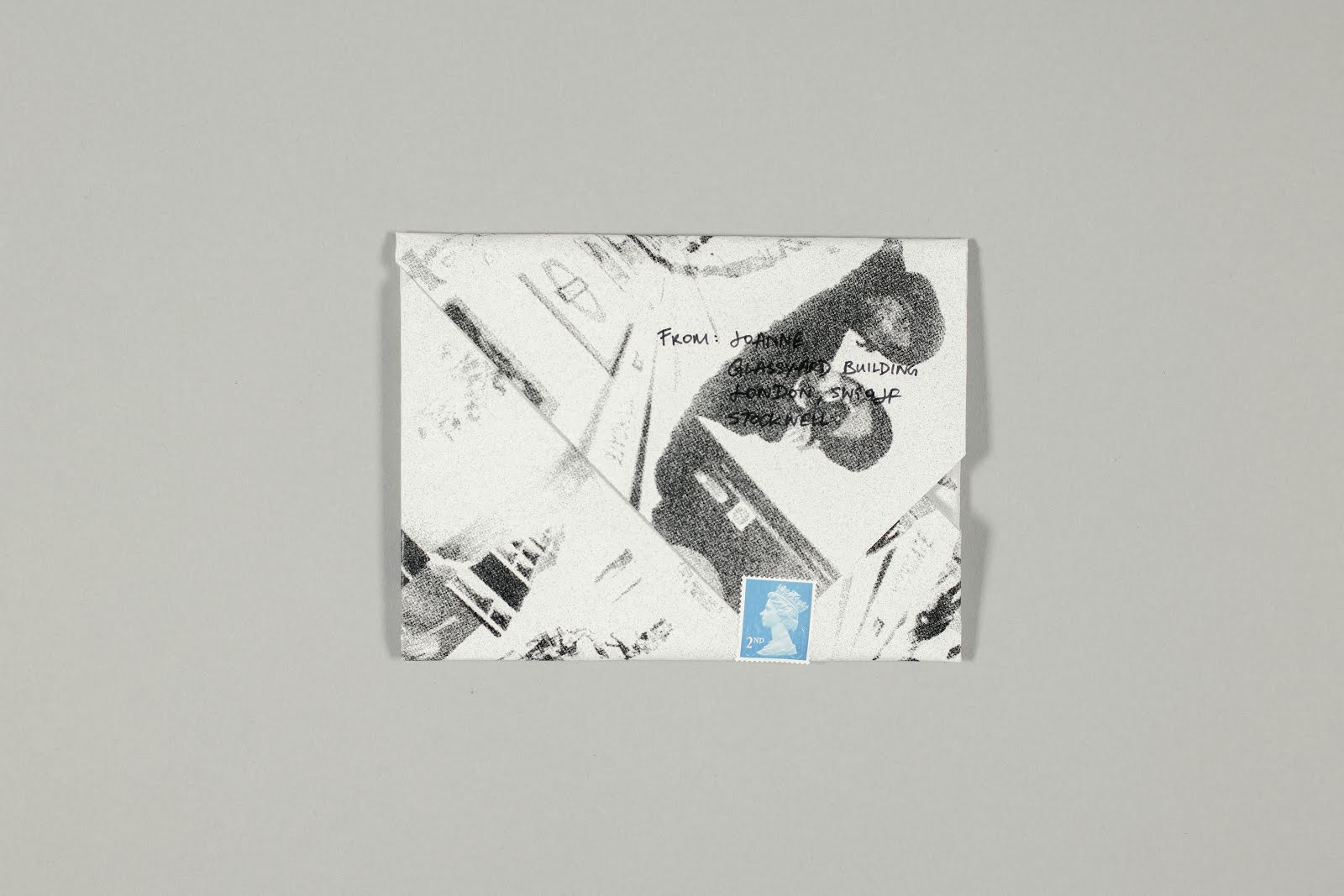
I decided to use an origami-style for the envelope design as I felt like it not only serves as a physical envelope but it can be morphed into a letter too, killing two birds with one stone.
Final designs

Final postcard design

Final envelope design
Final iteration


Photographed at the Copy Stand studio
Opening up my mail art
Overall thoughts
Over the course of this project, I struggled with trying to juggle between accomplishing the brief and the concept that I was going for. Looking at my first iteration, I could clearly see the concept being brought through physically, but it was not mailable. It was just too big. However, after much incubating over time and looking at my classmate's work, I simplified my execution. I tend to overthink my concept and try to execute literally when design is all about simplifying the already complicated world.
The discussion with my tutor helped me morph into my final iteration and I have learnt to take a step back before jumping straight into executing my concept literally.
Bibliography
Cornell, J. (1953) A Parrot for Juan Gris. Available at: https://www.apollo-magazine.com/art-diary/birds-of-a-feather-joseph-cornell-homage-to-juan-gris-met-museum/ (Accessed: 16 January 2020).
Hong, J.H. (2019) ‘KUHO 2019 SS’ [Instagram]. 24 June. Available at: https://www.instagram.com/p/BzGDi56AvRK/?igshid=13tqrl4iklha1x (Accessed: 21 January 2020).
Nakayama, K. (2019) ‘小花詩’ [Instagram]. 22 November. Available at: https://www.instagram.com/p/B5Kz8ZVAlN_/?igshid=1u5fmr6fzns6x (Accessed: 21 January 2020).
Rie (2019)‘@yerimiese’ [Instagram]. 28 May. Available at: https://www.instagram.com/p/Bx_lYqlnrsX/?igshid=igd4a9lxmso2 (Accessed: 21 January 2020).
Zhou, D. (2018) Joseph Cornell’s Boxes Coax, Captivate, and Channel Juan Gris. Available at: https://hyperallergic.com/428235/joseph-cornells-boxes-coax-captivate-and-channel-juan-gris/ (Accessed: 19 January 2020).
-
Brief
For this project, we were supposed to create a card/object that we would like to send back home. The theme is a response to something that I have accomplished during the last 2 months.
Just like any other project, I was lost at first. When we were posed with this question, "What have you accomplished during the last 2 months in London?", I was speechless. Frankly, I did not know what I accomplished because I was so caught up with school projects and just trying to adapt to life in London.
I decided to pen down my thoughts first before even coming up with an idea for a project.


Penning down thoughts in my sketchbook.
After penning down my thoughts, I realised that accomplishments do not have to be physical. Looking back at the past 2 months, I realised there's nothing that could dictate that I have accomplished something. There were no medals, trophies or certificates to show that. But I do know for a fact, I have learnt a lot about myself over the past 2 months. My likes and dislikes, personal growth, and how my lifestyle has shaped ever since I moved to London. Living away from my family, having to cope with being alone, I think that is an accomplishment in itself.
Incubating my thoughts
Over the weekend, I went to church and the pastor mentioned something along the lines of how we are flowers in resistance. That gave me the idea of how the flowers represented me growing through cracks, which represented London.

Developing my idea
I decided to call myself a resistance flower. A flower who is trying to find my way through London. It greatly reflected my situation right now as I just moved here not too long ago and having to cope with being alone.
Joseph Cornell was an artist that has greatly inspired the 1st iteration of this project. He is greatly remembered for his surrealist assemblage works housed in shallow wooden boxes.
A Parrot for Juan Gris (1953)
Joseph Cornell uses a method called papier collé. It is a type of collaging method in which paper is pasted to a flat-mount. In his work, he uses new scraps of newsprint and shards of mirrors. The difference between collage and papier collé is that the latter exclusively uses paper, while the former may use non-paper components to create the collage.
Like in "A Parrot for Juan Gris", he blurs the “fake” and the “real”: a paper bird rests on a wooden perch. His Gris series abounds in verbal and visual playfulness. By choosing the white cockatoo as the protagonist for his series, Cornell announces his intention to “parrot” Gris. Labels emblazoned “La Estrella” point to the “star” of the show. Zhou (2018)
1st iteration
For my first iteration, I wanted to incorporate what I have learnt at the photo collage workshop and read up about Joseph Cornell. The way he incorporated his images and pasted them together reminded me of cracks.

Photo collage of photos that I have taken in London
I have decided to use images that I have taken with my film camera over the course of my time in London. Pictures of parks, museums, etc. I scanned this and printed it using risograph as I wanted to mimic the "lo-fi" effect. Everything happened so fast, I couldn't believe it has been a few months since I moved to London therefore, I felt risograph fit that the most.
In the meantime, I bought a white photo frame from IKEA and decided to spray paint it blue. My concept for this project is to show me growing through my time here in London.
Photo collage = my time in London
Pressed flower = Me in London
Inspired by Cornell's work, I decided to use a photo frame and put these two together to show that concept.

Spray painting at the 3D workshop
I decided to spray paint the photo frame because it is my favourite colour and I also felt that it kind of resonated with how I felt when I first moved to London.


File prep for risograph print
I also added the words "NEW BEGINNINGS" and "UNCHARTED TERRITORIES" while leaving a gap in the middle which is where I will paste my pressed rose. The reason is to signify like I'm growing out of this experience while studying in London
1st iteration: Final Product


Photographed at the 3D tabletop
1st iteration: Feedback + Final Thoughts
Relooking at the final product, I honestly felt particularly ambiguous with it. Though it did successfully fit my concept it just does not look mailable. It's too big to mail and my tutor, Zarah, also asked about how am I going to mail this when we were asked to show our first iterations for this project. That was when I had to rethink about my physical product for the 2nd iteration.
2nd iteration
Relooking back at what I have achieved from the past few months that I have been in London, I realised it's not about being able to be independent, being able to cook, do my own laundry, get groceries, etc. I have always been independent even when I was in Singapore, but what changed was that I learnt more about myself. I grew and learnt to be watchful about my surroundings in London but also to be more accepting of others. I think that was what I have achieved. I was very narrow-minded back when I was in Singapore, and I think that mindset of being so comfortable in a country that I have lived all my life has influenced the way I work too. But ever since I have moved here, I slowly opened up and learnt a lot. I meet all types of people here in London and I think that in itself is an achievement too. Growing as a person in a new environment, like a budding flower.
I wanted to incorporate this personal growth of me into this project and also what my parents wanted to see from me. That was when I realised that what my parents want to see the most was me. Me in this current moment in London. They don't really have a physical photograph of me back in Singapore which was why I decided to make postcards of myself and send it back.
I asked a friend of mine who is a photography student at LCC if she would be willing to take some portraits for me and she was happy to help.
The concept for this photoshoot was simple = flowers and smiling. Since I was going for the flower concept, I thought it would be fitting to have me hold flowers while I was being photographed.
I also looked at some references from Instagram for inspiration:

Rie, 2019

Kyotaro Nakayama, 2019

Hong Jang Hyun, 2019
These photo references that I selected from Instagram generally have a very muted yet bright overtone. It brings out the liveliness of the photo and I think that is the look that I'm going for.
Photoshoot (Behind-the-scenes)

Setting up

Medium format film camera rented from the Kit Room, Mamiya RB67
For the photoshoot, we decided to take some photographs in digital and film. We wanted to mimic the colour that was shown in the references and came to the conclusion that film photography would best produce the effect. We would test the waters with the digital camera first and then pick out 10 poses that we like and I would have to mimic it again when we take photos in film, since we are using a medium format camera and are only limited to 1 roll which has only 10 exposures.


Photo test
When we finally decided to shoot on film, the photos did not turn out as expected it to be. It was really dark making it not usable. Therefore, I had to use the digital photos that we took previously.

Photo that we took with the film camera
Designing the Envelope

Figure 1. Rethinking my 2nd iteration
After the photoshoot, I edited the photos and was still contemplating on what I should add at the back of the postcard. Having just pictures of me as postcards felt a little weird as it is just images of me, nothing much. It doesn't really tell a story.
However, when I relooked at my first iteration, I realised I could use some of the elements, such as the photo collage. My thought process snowballed to my diary while I was looking at the photo collage that I made during my first iteration. It reminded me of how I wrote down my thoughts and feelings during my first few months in London. That was when I thought that maybe I could incorporate my diary entries into my postcards since it shows how much I have grown as a person. It's a very personal side of me but if it shines through the concept for this project, I thought maybe I should just go for it even if I'm revealing some of my deepest thoughts.
I did not want to show my whole diary entry because it can be quite long, so I selected excerpts from different diary entries, all in chronologic order so that I can show how I felt over time. By incorporating my thoughts and the corresponding images of me gradually smiling, I felt like it fit well with the theme.

Portraits that I have selected
Tutorial feedback

Tutorial feedback, written by Dinara
I showed my progress to Zarah and told her about my concept. She understood that I wanted to show growth throughout my postcards but she felt like my postcards did not show that because the portraits all look the same and it was taken on the same day. She felt that if the portraits were taken on different days it would have fit my concept better. However, I told her I did not want to remove the photos and take new ones due to time constraints. She then suggested that since I'm going with the "blooming flower" concept, I could illustrate stages of flowers blooming from my first diary entry to the last one. I personally felt that gave more meaning to my portraits.
Sketching

Postcard illustration sketches
I decided to also incorporate my photo collage and a flower pattern illustration for the envelope design as it fits the concept of my project. The flower pattern illustration representing me blooming and growing in London (the photo collage).

Flower pattern illustration sketch

Envelope mock-up
I decided to use an origami-style for the envelope design as I felt like it not only serves as a physical envelope but it can be morphed into a letter too, killing two birds with one stone.
Final designs

Final postcard design

Final envelope design
Final iteration


Photographed at the Copy Stand studio
Opening up my mail art
Overall thoughts
Over the course of this project, I struggled with trying to juggle between accomplishing the brief and the concept that I was going for. Looking at my first iteration, I could clearly see the concept being brought through physically, but it was not mailable. It was just too big. However, after much incubating over time and looking at my classmate's work, I simplified my execution. I tend to overthink my concept and try to execute literally when design is all about simplifying the already complicated world.
The discussion with my tutor helped me morph into my final iteration and I have learnt to take a step back before jumping straight into executing my concept literally.
Bibliography
Cornell, J. (1953) A Parrot for Juan Gris. Available at: https://www.apollo-magazine.com/art-diary/birds-of-a-feather-joseph-cornell-homage-to-juan-gris-met-museum/ (Accessed: 16 January 2020).
Hong, J.H. (2019) ‘KUHO 2019 SS’ [Instagram]. 24 June. Available at: https://www.instagram.com/p/BzGDi56AvRK/?igshid=13tqrl4iklha1x (Accessed: 21 January 2020).
Nakayama, K. (2019) ‘小花詩’ [Instagram]. 22 November. Available at: https://www.instagram.com/p/B5Kz8ZVAlN_/?igshid=1u5fmr6fzns6x (Accessed: 21 January 2020).
Rie (2019)‘@yerimiese’ [Instagram]. 28 May. Available at: https://www.instagram.com/p/Bx_lYqlnrsX/?igshid=igd4a9lxmso2 (Accessed: 21 January 2020).
Zhou, D. (2018) Joseph Cornell’s Boxes Coax, Captivate, and Channel Juan Gris. Available at: https://hyperallergic.com/428235/joseph-cornells-boxes-coax-captivate-and-channel-juan-gris/ (Accessed: 19 January 2020).


Comments
Post a Comment