Labyrinth Project
Brief
In teams of 3, we have to construct a labyrinth. We can use a camera or your phone, draw it on paper, choreograph a dance or build it with words and still images. You may find your labyrinth within the college, up and down the staircases of the Tower Block or at the Elephant and Castle Shopping Centre.
Ideation
When given the brief, our team consisting of me, Rachel and Tiffany decided to walk around LCC to get inspiration. We stumbled upon a playground near LCC and played there for a bit. We jumped on the trampoline and looked up and realised that we could go up to the highest floor of the tower block at LCC to get some inspiration. Therefore, after our 'play session' we went back up to the tower block and looked down at the streets.


Pictures taken from the 14th floor of the Tower Block
Our team was inspired by how the roads of London are a labyrinth in itself. However, when it was time for us to present, we were still lost with what we should do. Sophia came in later in the day and joined our team, however, our team was still clueless.
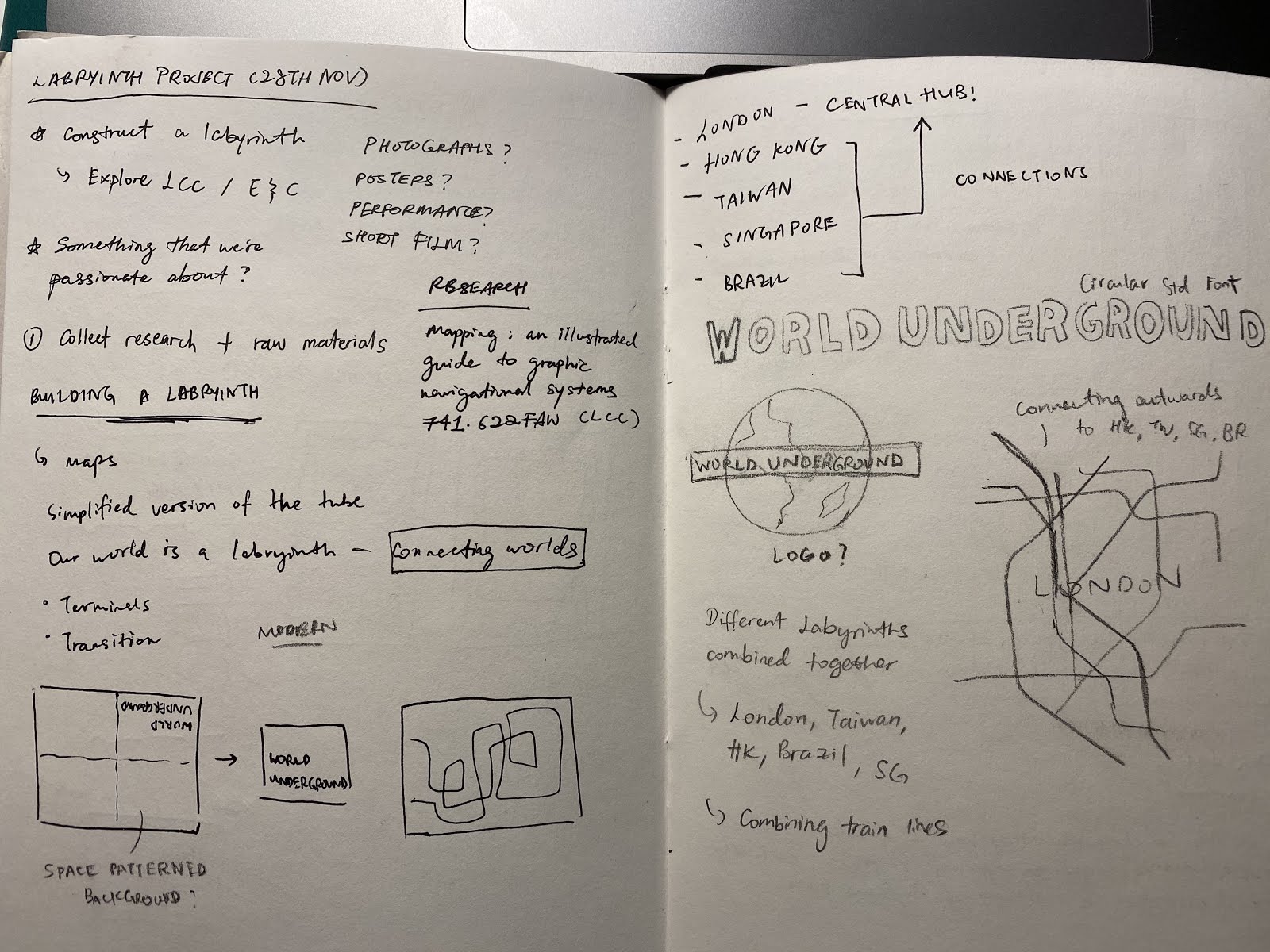
It was until when we let other groups present we suddenly had an idea. An idea that came out of nowhere. Since we were looking down at London, it reminded us of the metro, and that was when we were inspired to combine all of our countries' metro lines into one big metro map. (see Figure 1.)

Figure 1. Scribbled idea
We quickly scribbled our idea onto a random piece of paper as we were worried that we would forget about it.

Writing down our ideas
Our team wanted to combine all of our metro lines into one metro map, we decided to choose 5 main stations from our metro and create a fictional one. However, our team soon realised that the challenge was having to actually create one. It was not a simple task and it could only be done by one person. We wanted our project to collaborative and have everyone have to participate in the making of the labyrinth.

Figure 2. Image by Rachel
On one of our DMS classes, Zarah, our tutor, showed us a few examples of works that are related to labyrinths. We stumbled upon an example that showed us cut-outs being bound together (see Figure 2). This gave us the idea of cutting out small sections of metro lines to create a whole new labyrinth. Unfortunately, we were not able to find out who was the original artist as Zarah said she picked it off from Pinterest.
During that same class, we also saw a doodle that was drawn on the whiteboard by the previous class (see Figure 3).

Doodle was drawn by someone on the whiteboard
This doodle inspired us to create characters that would represent our countries respectively. Our idea was to illustrate our characters similar to the style that was drawn on the whiteboard and have it screen-printed on the paper that we were going to cut out our metro lines so that it would like an underground world. We were going for this concept because we wanted to show more than just our country's metro line, but its culture too.

Writing our ideas
During that class, we then proceeded to try out this idea and cut out the metro lines using coloured paper that we found lying around in class.

Our first mock-up
I then personally did some research on how we could visually translate our country's culture into illustrations. I found 2 books that were relevant to our project and that maybe could help us brainstorm more ideas for the illustrations that we were going to create.
The first book is called "Design and Form The Basic Course at the Bauhaus" by Johannes Itten.


Figure 3. Itten (1965, p. 74)
I was looking for references from Bauhaus as I was intrigued by how this art movement managed to use such simple to create such intricate illustrations. In Figure 3, the image shows a hand-knotted Smyrna rug. The rug has very interesting imagery as it uses different shapes to create this one cohesive illustration. It inspired our team to create a cohesive illustration that would fit our 'cut-out'
Another book that I found was "Visual Grammar" by Christian Leborg.

Figure 4. Leborg (2006, p. 28-29)
In pages 28 and 29 of the book, it shows we could create different shape forms to tell a visual narrative. These shapes are categorised according to Geometric, Organic and Random forms depending on how we manipulate it. I thought this was a very informative page as it taught us how we could use these simple shapes to create our illustration for our respective countries.
Group discussion
Before Christmas break, Tiffany and I went to Rachel's flat to discuss further and how we could develop our idea of creating characters for our countries. Sophia was unavailable at that time because she was sick. Though we already solidified our concept, we were still unsure of how to proceed on with creating our illustrations as we have no reference. I told Rachel and Tiffany about the research that I have done and they were intrigued by how we could use shapes to create our illustration. However, suddenly Rachel said that this research material reminded her of an artist called Keith Haring who is known for his bold illustrations with quirky shapes. We then decided to use Keith Haring as our main reference as it only fit our concept but also the style that we were going for.
'Matrix' by Haring (1983)
In this particular drawing by Haring that we selected, it showcases different quirky characters that are all combined with lines and shapes. We wanted to make use of this method to create our illustration for each country. By doing so, our team decided that during the break we would draw out a mind map and list down key cultural characteristics of our country.

The mind map that I came up of Singapore
From there, we would select about 5 things that best represent our country and we would go back during the holidays to sketch out our illustration.

Illustration sketch inspired by Keith Haring

Sketch rendered in Illustrator
I then rendered my sketch into Illustrator. My illustration included characteristics of Singapore such as the food, architecture, etc.
Printing our illustrations
Our idea was to screenprint these illustrations on the backside of the coloured paper that we are going to cut our metro lines and then bind all of them together so that it flips out like a book and when its flipped to the next page, we could see the back with our country's illustration.
Since our final size of the book is A5, we placed 2 illustrations each on an A4 document so that we could print it out on laser film and transfer it to our stencils.

Cleaning our stencils
Screenprinting was a blur at first as most of us already forgot what we learnt the induction that we went. It was the first time since the induction that we came back to use the screenprinting facilities.
We soon realised that the way we layout our film on the laser film was wrong as we thought we could screenprint our illustration on the A5 coloured paper that we cut, turns out we had to use a bigger paper in order to prevent the paint from smudging everywhere else. Therefore, we had no choice but to change our idea completely and print our illustrations on a separate piece of paper. We bought paper from the screenprinting studio and cut them to A3. Our team decided to place these pieces of paper that have our illustration printed on it, behind our respective country so that when we see through the 'labyrinth', it shows our country.
Our team discussed what colours would fit our illustration and it would have been paired up with the coloured paper that we used.
Coloured paper that each country uses:
Hong Kong - red
Taiwan - blue
Singapore - Yellow
Brazil - green
We mainly chose our colours based on our national flag, but since Singapore and Hong Kong has the same colour on our national flag I decided to forgo the colour red and use yellow instead as Singapore is very warm and I felt the yellow colour represented that, not only that, it was really bright.
Eventually, we decided to print our illustrations orange and blue. For Hong Kong and Singapore, it will be printed using blue colour, while Taiwan and Brazil will use orange colour. We felt these colours complimented our coloured paper very well.

Transferred laser film to stencil

Screenprinting our illustrations


Our final prints
The colours came out very well. Though it was our first time printing our own illustration, we were satisfied with the results. We then proceeded to cut them to A5 size. However, after discussing with the team, we decided to rng bind instead of using Japanese binding as we realised that Japanese binding we could cover up our design and it would not flip very smoothly.
Our team went down to the art shop and bought a ring and got our illustrations bound together at the print and finishing room.
Final result


Flipping through labyrinths
Overall thoughts
This project was very enjoyable as we got to explore and play a little bit for research. We all each got to have our input into the final product and I think that was the most meaningful part. It was not just a project about creating labyrinths but putting together each culture and creating a cohesive product that fulfiled the brief too. Initially, we were struggling with having to come up with ideas, however, I think what was important was to not rush into coming up with something but to just let it come naturally.
The execution part of this project was a little stressful as we were a little unsure of how we were going to print our illustrations and to showcase our labyrinth. However, with the moral support from the team and communicating with each other, we managed to pull through printing our works and finishing this project successfully.
Bibliography
Itten, J. (1965) Design and Form The Basic Course at the Bauhaus. London: Thames and Hudson.
Leborg, C. (2006) Visual Grammar. New York: Princeton Architectural Press.
Haring, K. (1983) Matrix. Available at: https://www.art-critique.com/en/2019/06/keith-haring-retrospective-at-tate-liverpool/ (Accessed: 23 January 2020).
In teams of 3, we have to construct a labyrinth. We can use a camera or your phone, draw it on paper, choreograph a dance or build it with words and still images. You may find your labyrinth within the college, up and down the staircases of the Tower Block or at the Elephant and Castle Shopping Centre.
Ideation
When given the brief, our team consisting of me, Rachel and Tiffany decided to walk around LCC to get inspiration. We stumbled upon a playground near LCC and played there for a bit. We jumped on the trampoline and looked up and realised that we could go up to the highest floor of the tower block at LCC to get some inspiration. Therefore, after our 'play session' we went back up to the tower block and looked down at the streets.


Pictures taken from the 14th floor of the Tower Block
Our team was inspired by how the roads of London are a labyrinth in itself. However, when it was time for us to present, we were still lost with what we should do. Sophia came in later in the day and joined our team, however, our team was still clueless.
It was until when we let other groups present we suddenly had an idea. An idea that came out of nowhere. Since we were looking down at London, it reminded us of the metro, and that was when we were inspired to combine all of our countries' metro lines into one big metro map. (see Figure 1.)

Figure 1. Scribbled idea
We quickly scribbled our idea onto a random piece of paper as we were worried that we would forget about it.
Writing down our ideas
Our team wanted to combine all of our metro lines into one metro map, we decided to choose 5 main stations from our metro and create a fictional one. However, our team soon realised that the challenge was having to actually create one. It was not a simple task and it could only be done by one person. We wanted our project to collaborative and have everyone have to participate in the making of the labyrinth.

Figure 2. Image by Rachel
On one of our DMS classes, Zarah, our tutor, showed us a few examples of works that are related to labyrinths. We stumbled upon an example that showed us cut-outs being bound together (see Figure 2). This gave us the idea of cutting out small sections of metro lines to create a whole new labyrinth. Unfortunately, we were not able to find out who was the original artist as Zarah said she picked it off from Pinterest.
During that same class, we also saw a doodle that was drawn on the whiteboard by the previous class (see Figure 3).

Doodle was drawn by someone on the whiteboard
This doodle inspired us to create characters that would represent our countries respectively. Our idea was to illustrate our characters similar to the style that was drawn on the whiteboard and have it screen-printed on the paper that we were going to cut out our metro lines so that it would like an underground world. We were going for this concept because we wanted to show more than just our country's metro line, but its culture too.

Writing our ideas
During that class, we then proceeded to try out this idea and cut out the metro lines using coloured paper that we found lying around in class.

Our first mock-up
I then personally did some research on how we could visually translate our country's culture into illustrations. I found 2 books that were relevant to our project and that maybe could help us brainstorm more ideas for the illustrations that we were going to create.
The first book is called "Design and Form The Basic Course at the Bauhaus" by Johannes Itten.


Figure 3. Itten (1965, p. 74)
I was looking for references from Bauhaus as I was intrigued by how this art movement managed to use such simple to create such intricate illustrations. In Figure 3, the image shows a hand-knotted Smyrna rug. The rug has very interesting imagery as it uses different shapes to create this one cohesive illustration. It inspired our team to create a cohesive illustration that would fit our 'cut-out'
Another book that I found was "Visual Grammar" by Christian Leborg.

Figure 4. Leborg (2006, p. 28-29)
In pages 28 and 29 of the book, it shows we could create different shape forms to tell a visual narrative. These shapes are categorised according to Geometric, Organic and Random forms depending on how we manipulate it. I thought this was a very informative page as it taught us how we could use these simple shapes to create our illustration for our respective countries.
Group discussion
Before Christmas break, Tiffany and I went to Rachel's flat to discuss further and how we could develop our idea of creating characters for our countries. Sophia was unavailable at that time because she was sick. Though we already solidified our concept, we were still unsure of how to proceed on with creating our illustrations as we have no reference. I told Rachel and Tiffany about the research that I have done and they were intrigued by how we could use shapes to create our illustration. However, suddenly Rachel said that this research material reminded her of an artist called Keith Haring who is known for his bold illustrations with quirky shapes. We then decided to use Keith Haring as our main reference as it only fit our concept but also the style that we were going for.
'Matrix' by Haring (1983)
In this particular drawing by Haring that we selected, it showcases different quirky characters that are all combined with lines and shapes. We wanted to make use of this method to create our illustration for each country. By doing so, our team decided that during the break we would draw out a mind map and list down key cultural characteristics of our country.

The mind map that I came up of Singapore
From there, we would select about 5 things that best represent our country and we would go back during the holidays to sketch out our illustration.

Illustration sketch inspired by Keith Haring

Sketch rendered in Illustrator
I then rendered my sketch into Illustrator. My illustration included characteristics of Singapore such as the food, architecture, etc.
Printing our illustrations
Our idea was to screenprint these illustrations on the backside of the coloured paper that we are going to cut our metro lines and then bind all of them together so that it flips out like a book and when its flipped to the next page, we could see the back with our country's illustration.
Since our final size of the book is A5, we placed 2 illustrations each on an A4 document so that we could print it out on laser film and transfer it to our stencils.

Cleaning our stencils
Screenprinting was a blur at first as most of us already forgot what we learnt the induction that we went. It was the first time since the induction that we came back to use the screenprinting facilities.
We soon realised that the way we layout our film on the laser film was wrong as we thought we could screenprint our illustration on the A5 coloured paper that we cut, turns out we had to use a bigger paper in order to prevent the paint from smudging everywhere else. Therefore, we had no choice but to change our idea completely and print our illustrations on a separate piece of paper. We bought paper from the screenprinting studio and cut them to A3. Our team decided to place these pieces of paper that have our illustration printed on it, behind our respective country so that when we see through the 'labyrinth', it shows our country.
Our team discussed what colours would fit our illustration and it would have been paired up with the coloured paper that we used.
Coloured paper that each country uses:
Hong Kong - red
Taiwan - blue
Singapore - Yellow
Brazil - green
We mainly chose our colours based on our national flag, but since Singapore and Hong Kong has the same colour on our national flag I decided to forgo the colour red and use yellow instead as Singapore is very warm and I felt the yellow colour represented that, not only that, it was really bright.
Eventually, we decided to print our illustrations orange and blue. For Hong Kong and Singapore, it will be printed using blue colour, while Taiwan and Brazil will use orange colour. We felt these colours complimented our coloured paper very well.

Transferred laser film to stencil

Screenprinting our illustrations


Our final prints
The colours came out very well. Though it was our first time printing our own illustration, we were satisfied with the results. We then proceeded to cut them to A5 size. However, after discussing with the team, we decided to rng bind instead of using Japanese binding as we realised that Japanese binding we could cover up our design and it would not flip very smoothly.
Our team went down to the art shop and bought a ring and got our illustrations bound together at the print and finishing room.
Final result


Flipping through labyrinths
Overall thoughts
This project was very enjoyable as we got to explore and play a little bit for research. We all each got to have our input into the final product and I think that was the most meaningful part. It was not just a project about creating labyrinths but putting together each culture and creating a cohesive product that fulfiled the brief too. Initially, we were struggling with having to come up with ideas, however, I think what was important was to not rush into coming up with something but to just let it come naturally.
The execution part of this project was a little stressful as we were a little unsure of how we were going to print our illustrations and to showcase our labyrinth. However, with the moral support from the team and communicating with each other, we managed to pull through printing our works and finishing this project successfully.
Bibliography
Itten, J. (1965) Design and Form The Basic Course at the Bauhaus. London: Thames and Hudson.
Leborg, C. (2006) Visual Grammar. New York: Princeton Architectural Press.
Haring, K. (1983) Matrix. Available at: https://www.art-critique.com/en/2019/06/keith-haring-retrospective-at-tate-liverpool/ (Accessed: 23 January 2020).


Comments
Post a Comment